web design for japandi interior design studio
Client
Industry
Services
Market
About the project
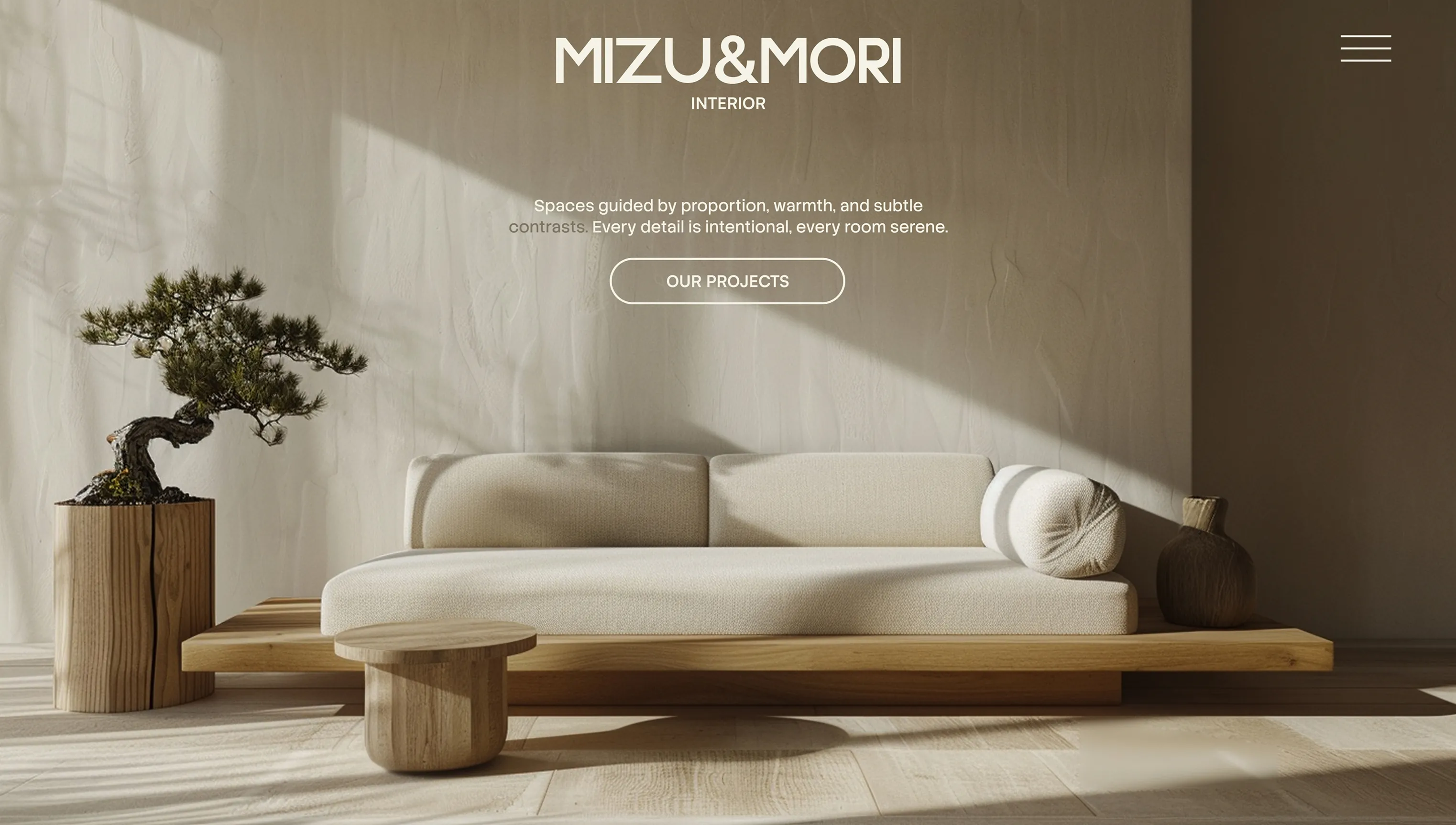
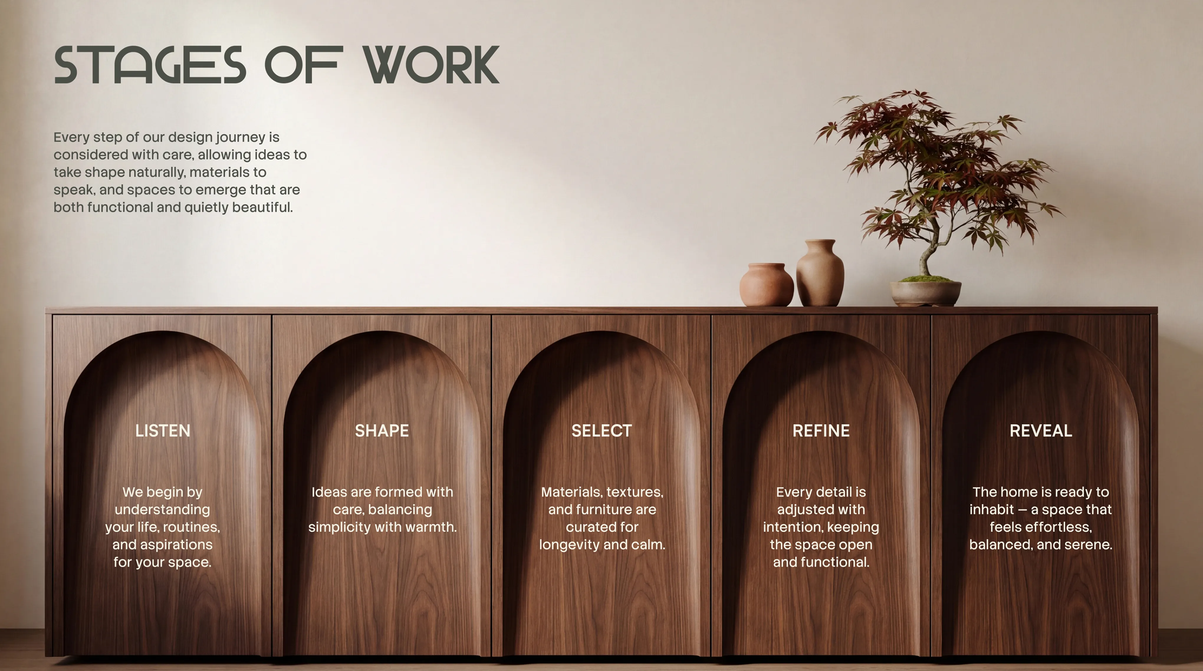
MiZU&MORI is a self-initiated concept — a Japandi interior studio we built from scratch. The brief we set for ourselves: create a complete brand and multi-page website that earns trust through restraint. No flashy claims, no heavy decoration. Just spaces that speak.
Challenge
Japandi as an aesthetic is easy to say and hard to execute. The risk was either going too Japanese — cold, sparse, inaccessible — or too Scandinavian — warm but generic. The design had to sit in the exact tension between the two, and the brand name had to carry that duality from the first glance.
Solution
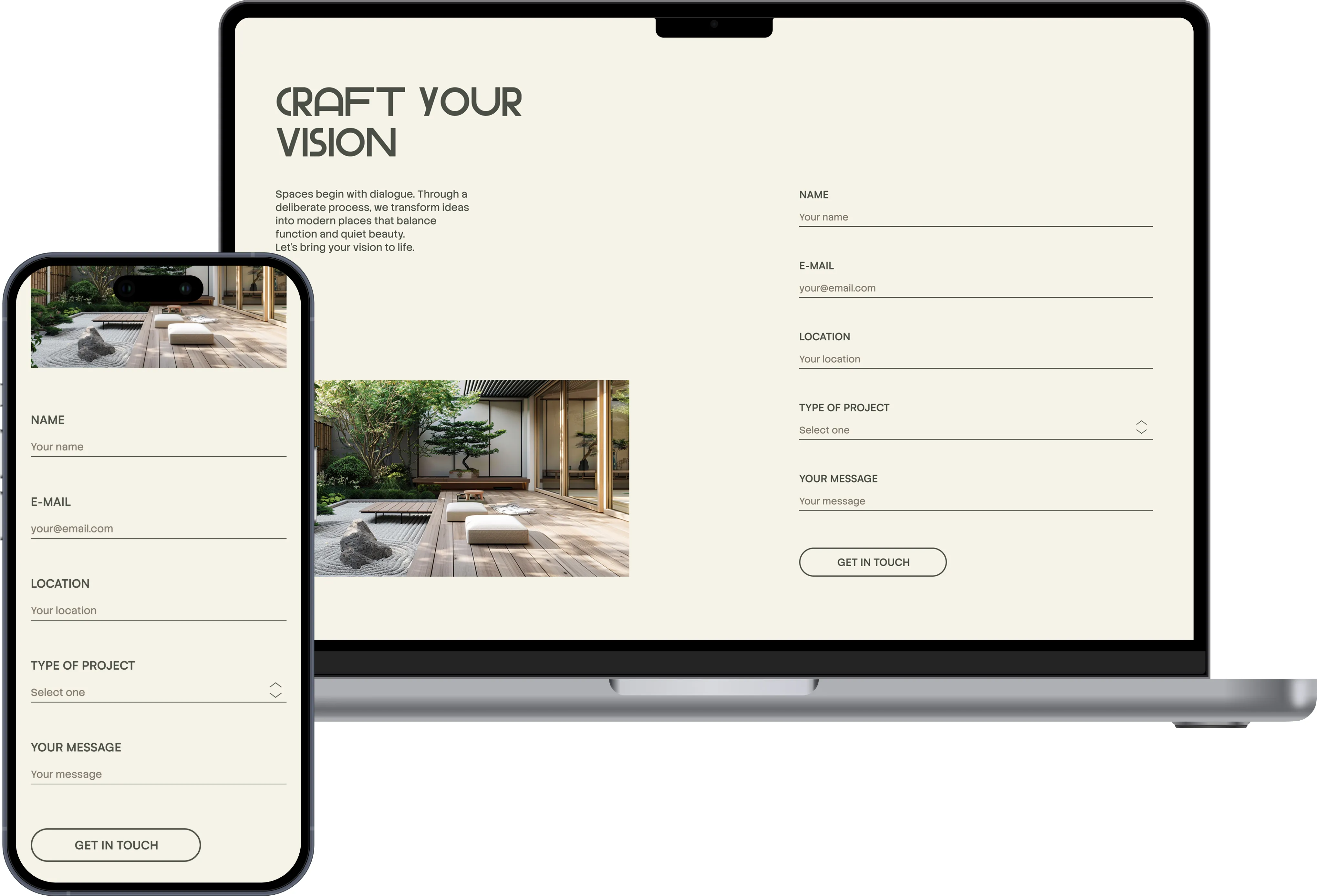
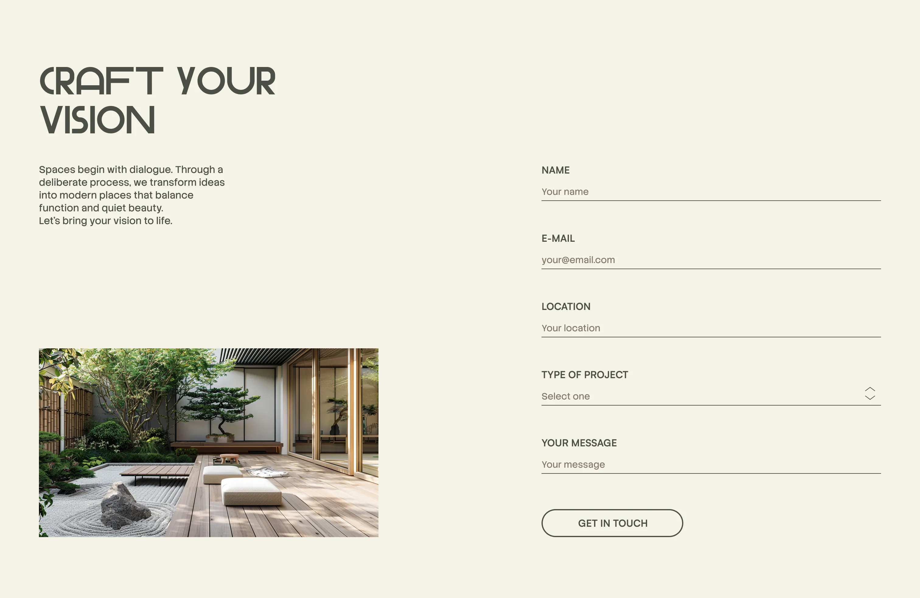
A website built around editorial rhythm — full-bleed photography, deliberate white space, and copy that leads with philosophy rather than a list of services. Every layout decision steps back so the work can speak for itself.
Homepage
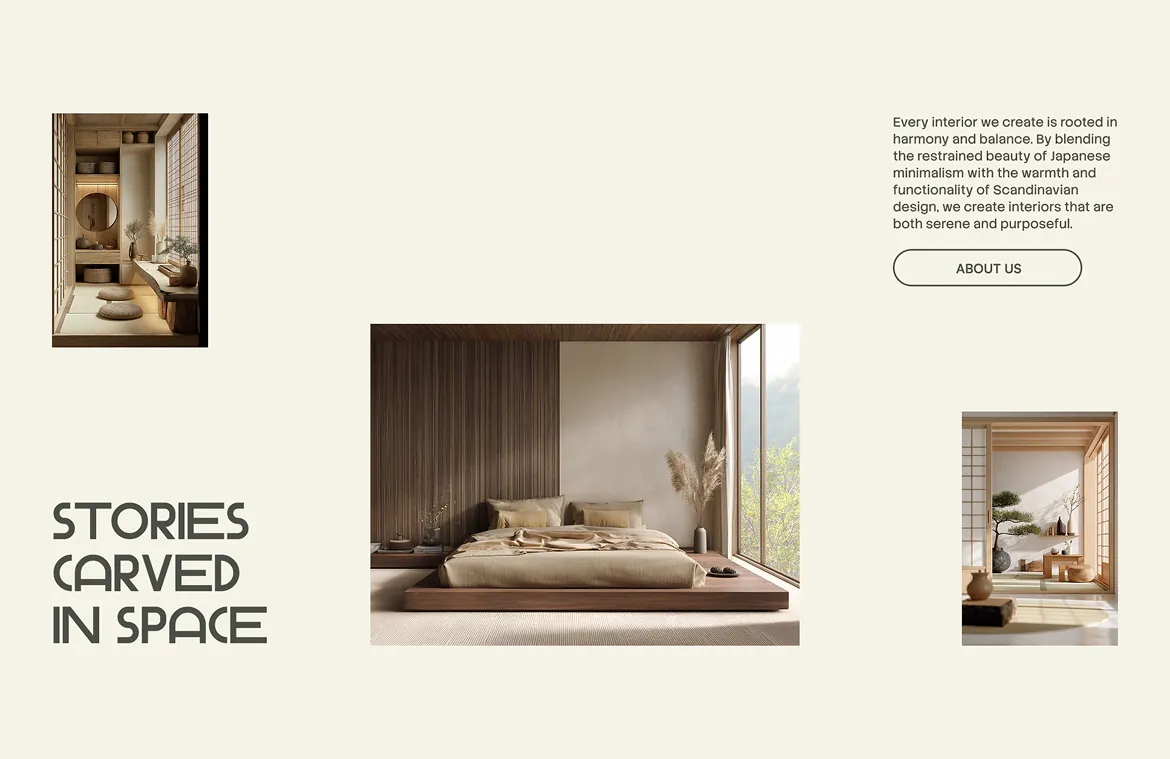
The intentionality of every detail is one of the philosophies of this brand, so we showed this from the first screen — both verbally and non-verbally, through a tagline that rewards a second glance.
Homepage
The “About us” section sits second on the homepage deliberately. A visitor who knows what the studio stands for will see every project that follows differently.

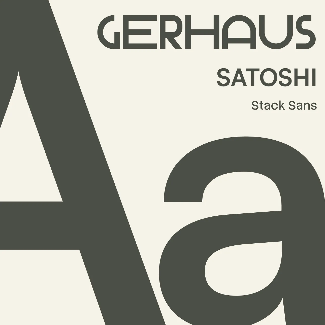
水 (mizu) — water. 森 (mori) — forest.A name rooted in nature, and a studio that takes that literally — every space built from natural materials only. The palette follows the same principle — moss, clay, ecru. Three typefaces: Gerhaus leads, Satoshi structures, Stack Sans carries the words.
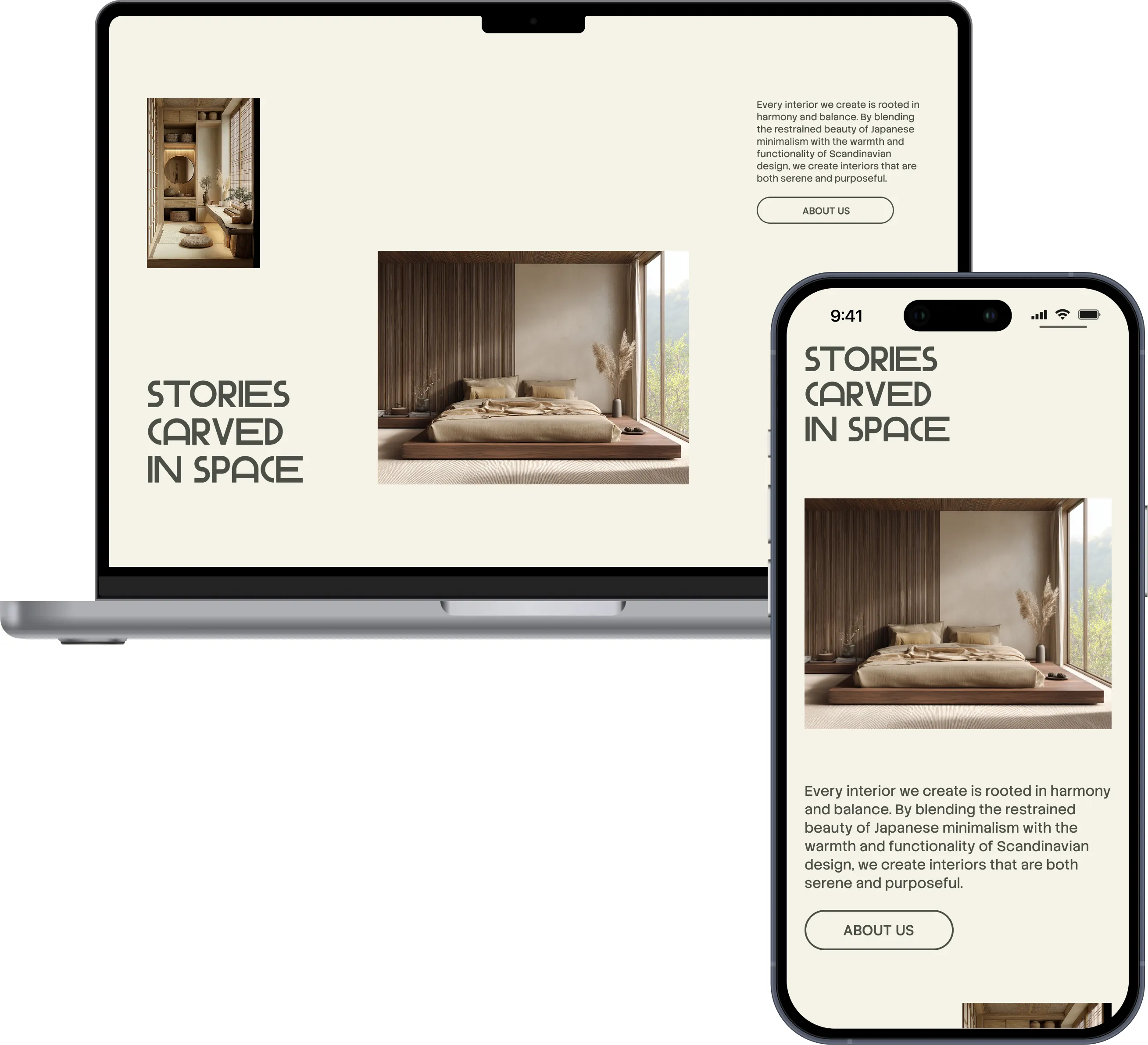
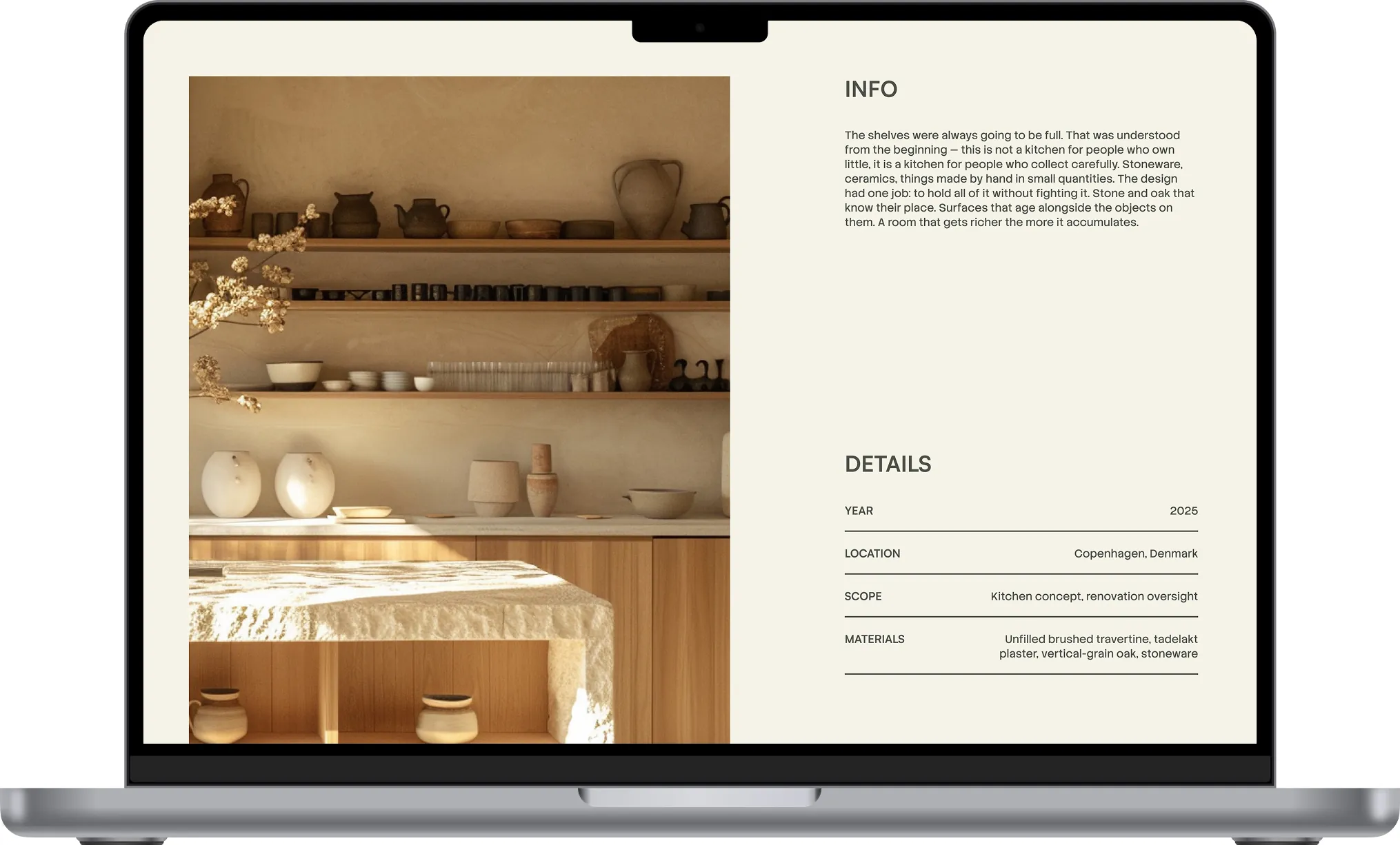
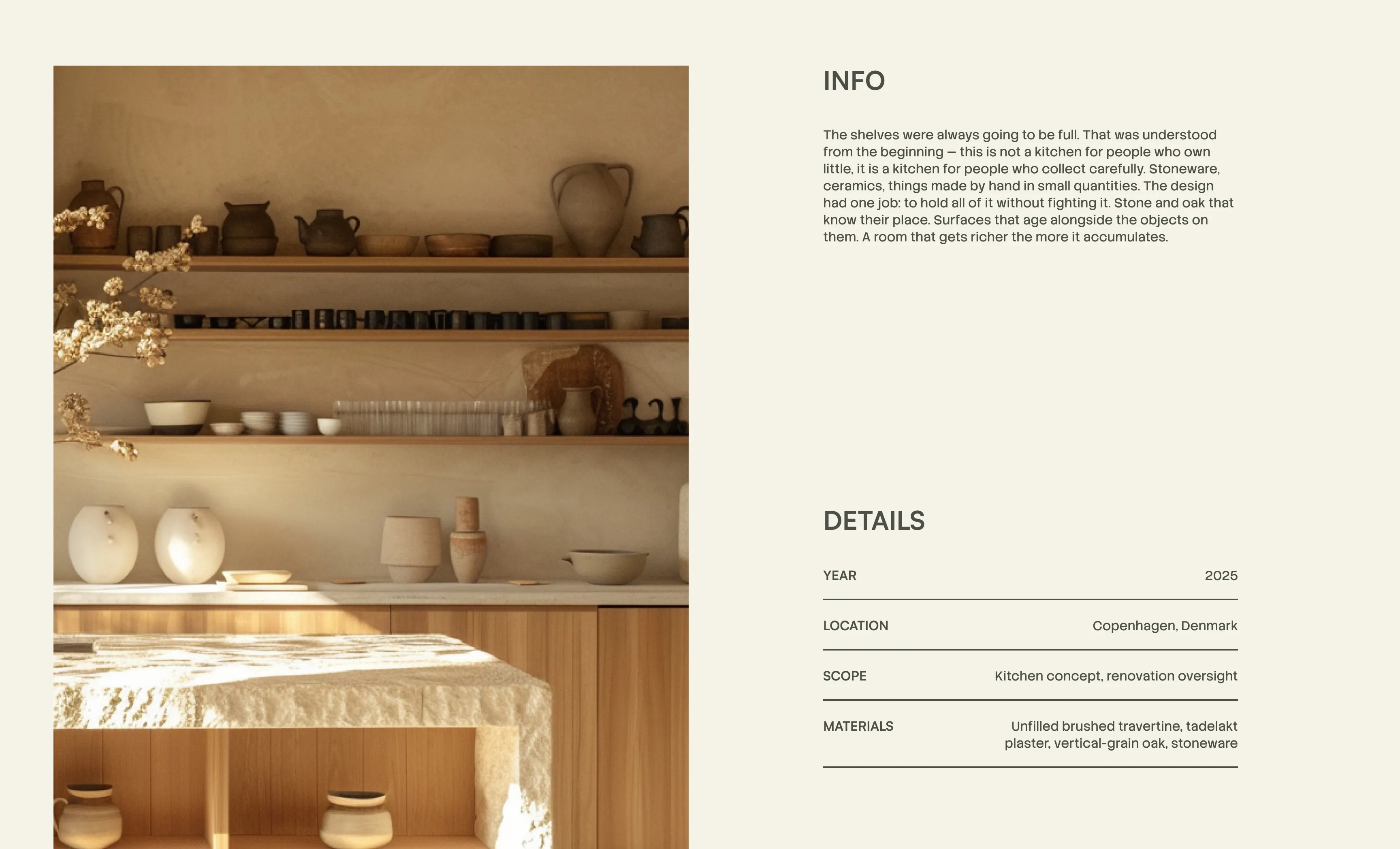
The project page opens with the room, not the brief. The paragraph comes before the details because the feeling of a space should land before its coordinates. Metadata is there for whoever needs it. The image is there for everyone else.

Spatial thinking
No surface is wasted. The studio finds potential in every element of a space — and the design shows that before the client even walks through the door.